Morro do Ipê And Porto Sudeste Unified template for two companies
Creation of a unified template for the websites of Mineradora Morro do Ipê and Porto Sudeste, featuring a shared design system, standardized components, a navigable Figma prototype, and a corporate visual language for two brands within the same group.
Categories
Tools

Tags
The Project
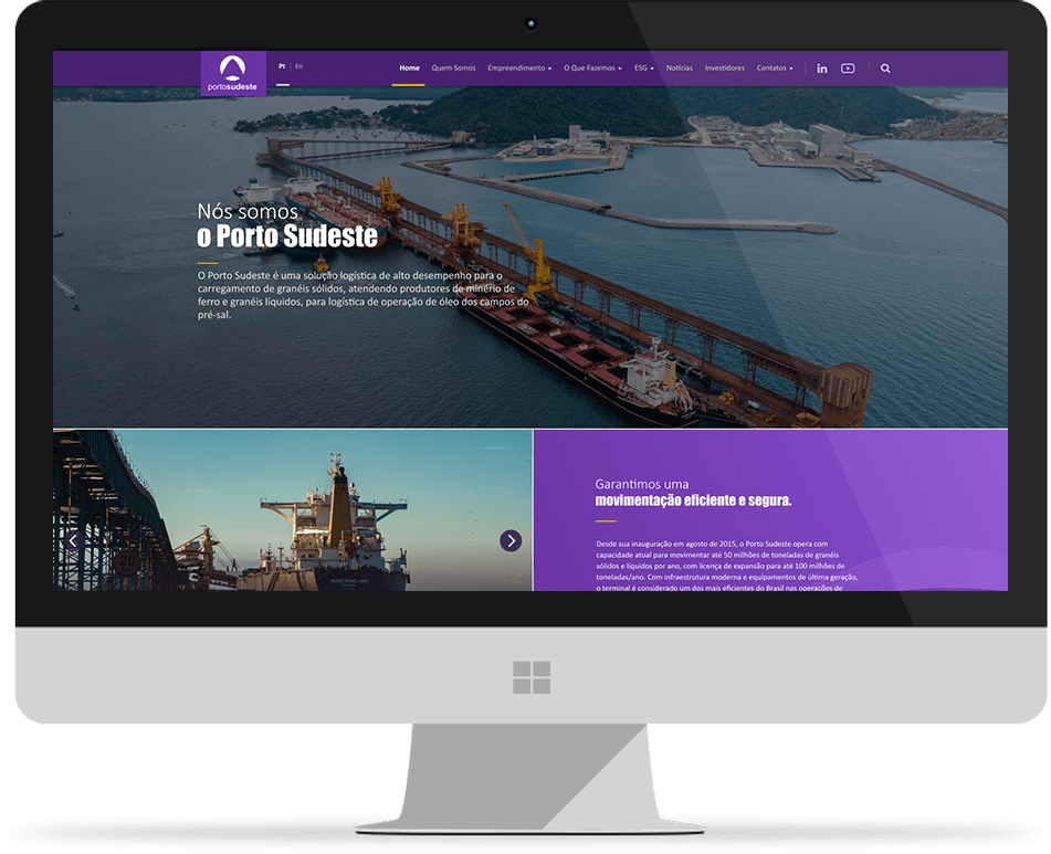
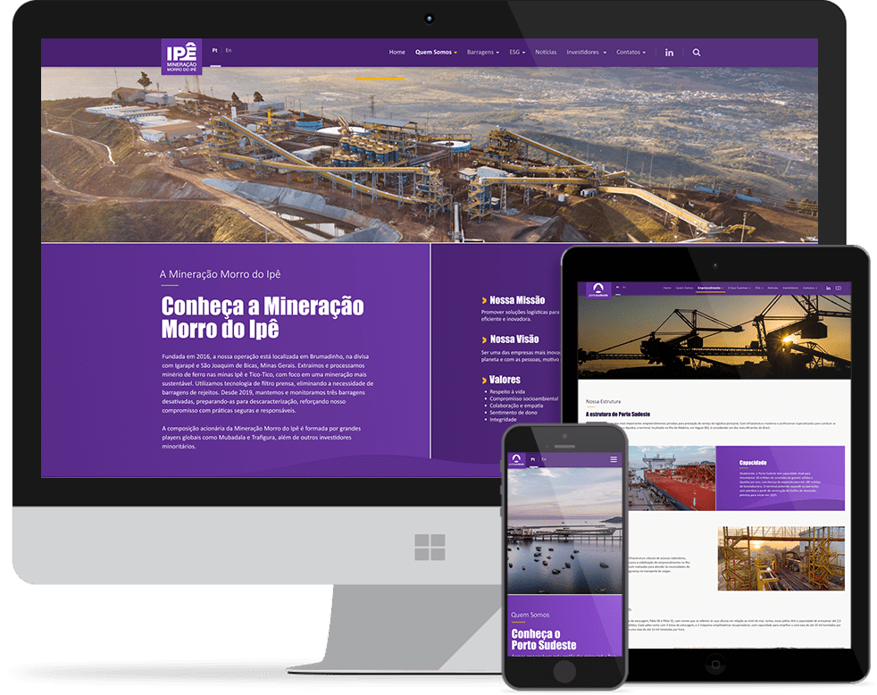
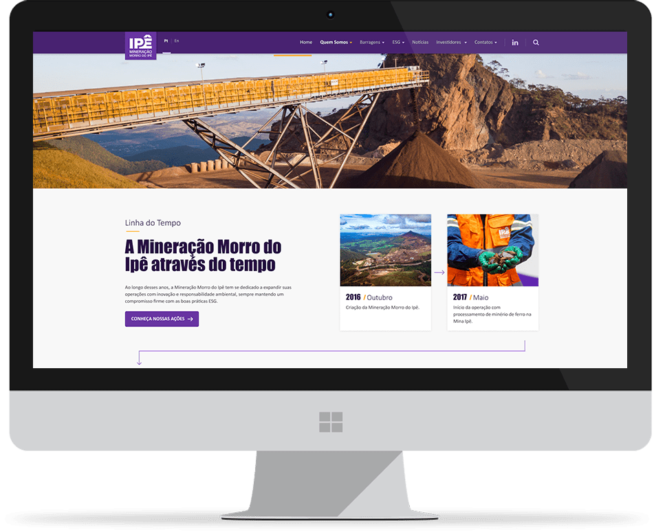
As a service provider for Titânio Agency, I took part in creating the layout for two websites belonging to companies within the same group: Mineradora Morro do Ipê and Porto Sudeste. The goal was to develop a shared visual foundation between both brands, respecting their particularities while maintaining a consistent digital language across their environments.
Design System
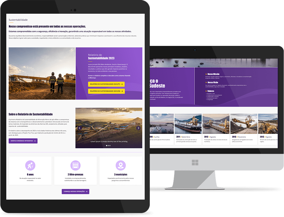
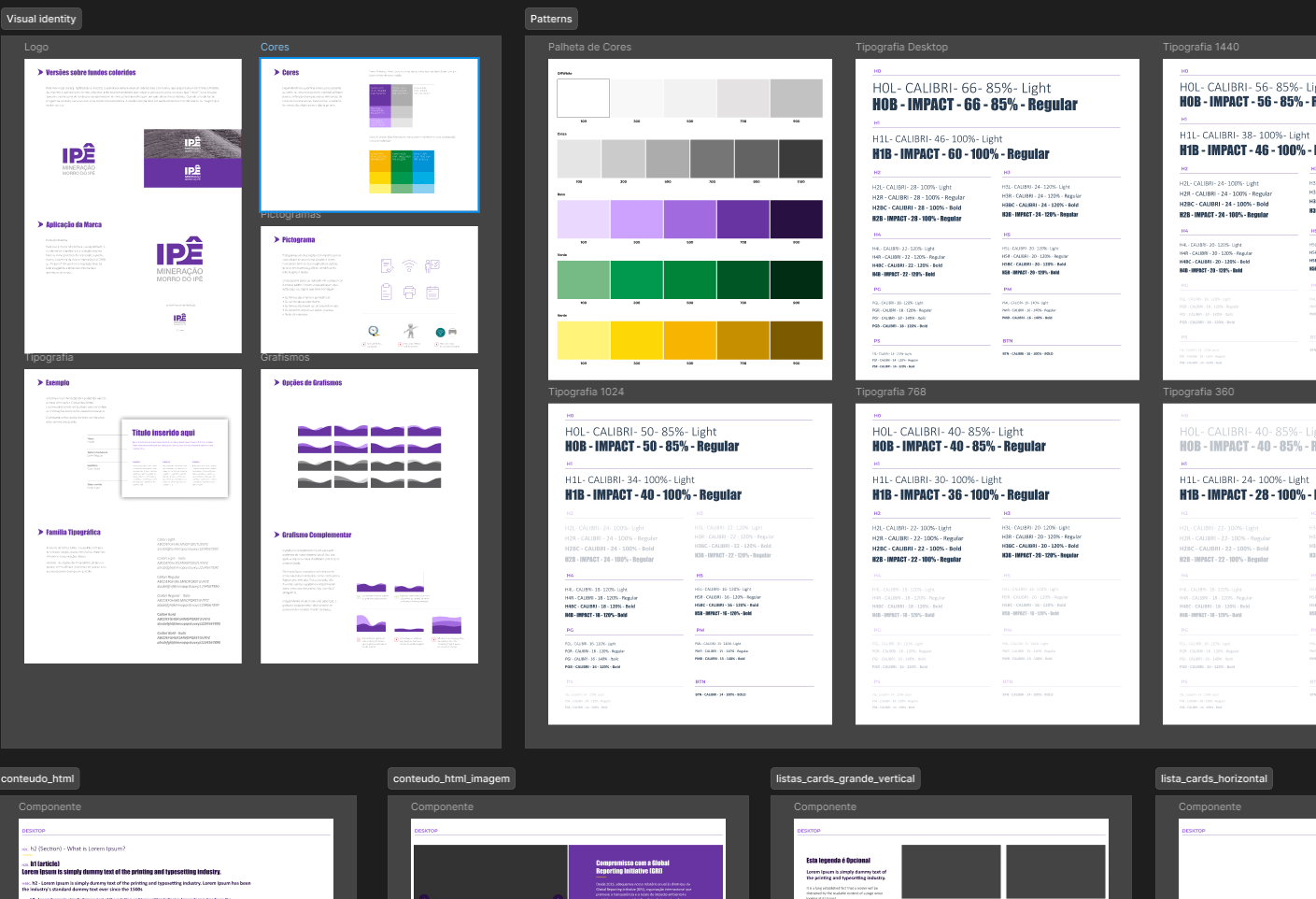
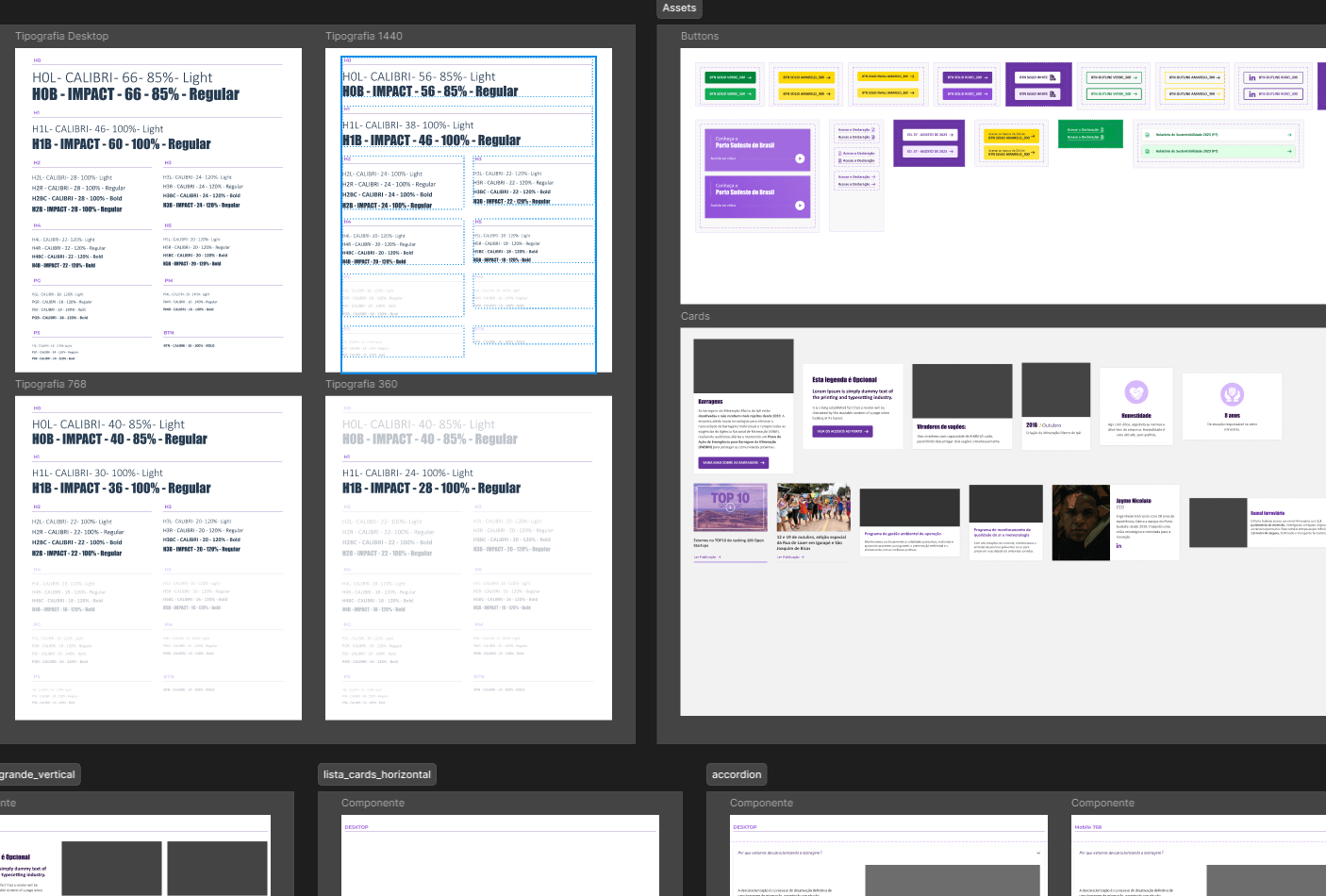
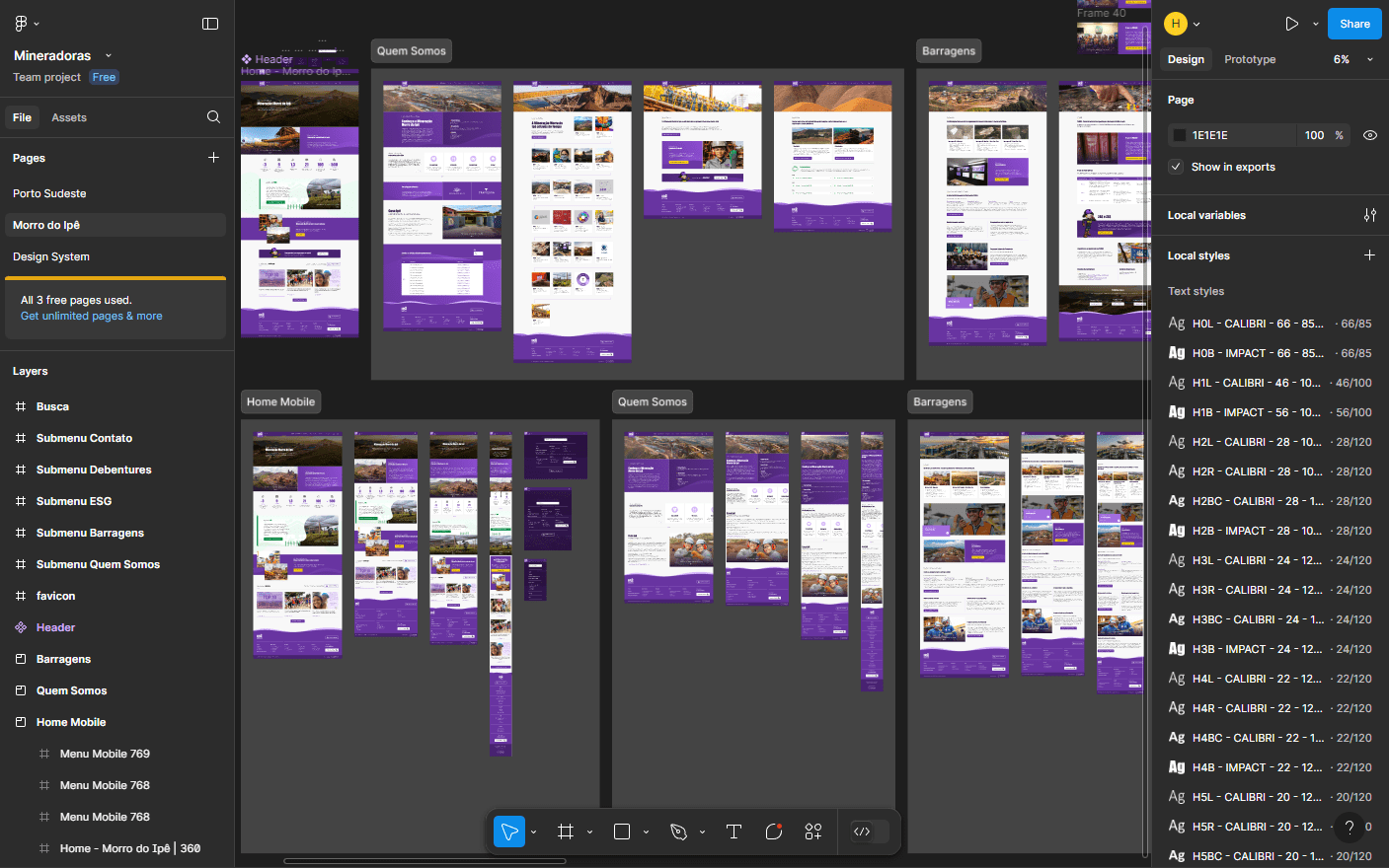
One of the main challenges was structuring a single design system capable of supporting companies from distinct sectors — mining and port operations. To achieve this, I built a flexible visual foundation designed to accommodate different types of content without losing unity, coherence, or corporate identity.
Another key aspect was the color definition. Both companies already used purple as both a primary and secondary color, and the requirement was to introduce a third supporting color to highlight interface elements. Since purple does not directly connect with the visual universe of these industries, I opted for a more sober approach, using geometric shapes and a corporate visual language. This made it possible to balance brand identity with the companies’ operational context.
The Websites
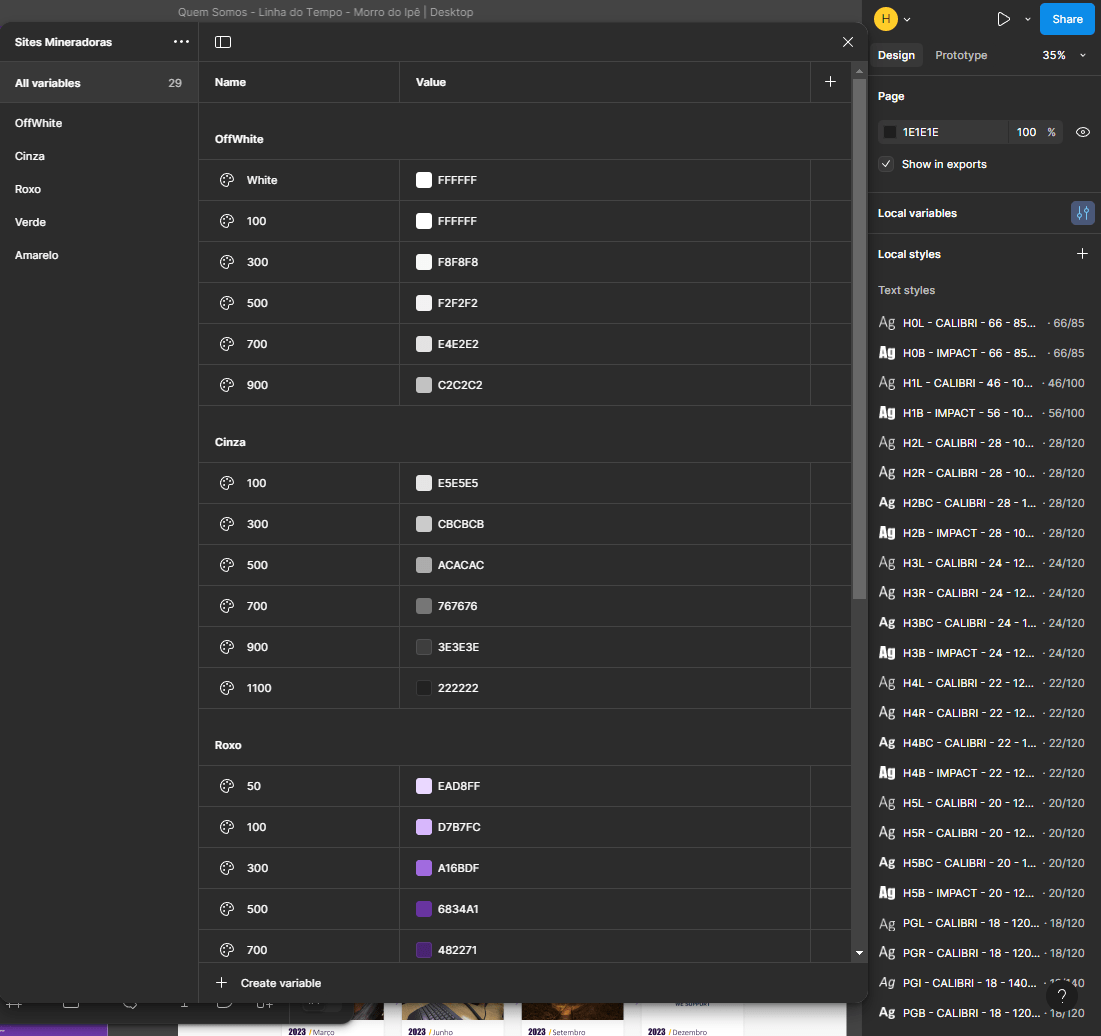
The project was developed in Figma, with a navigable prototype and functional components, including elements such as interactive accordions. In addition, I structured the design system using auto layout, standardized alignments and spacing, and defined typography and color variables. The foundation of both websites was built from reusable components, ensuring visual consistency, scalability, and efficiency in project maintenance.